The presentation provides information to a wide range of people with various...


A key concept common to shoe stores in the mid- and high-price segments today: optimal value for money. The idea is not new. The question is how to implement it. A competent visual presentation of the product gives the store the opportunity to express its concept as accurately and clearly as possible.
The point is that quality needs to be able to be staged. His idea should be inspired by the design, selection of colors, smells in the store and of course the display. If the quality level meets the needs of the target group, even a prudent buyer will approve of a high price in such a staging.
What are the signs indicating the quality of a product? First of all, this is, excuse the repetition, a high-quality presentation: the product is clearly visible, and all its individual features are read by the buyer without the participation of an intermediary seller. And this is possible if as few models as possible participate in the presentation. Luxury means having space not only for the customer, but also for the product itself. This presentation indicates quality.
But, you say, we have a wide range and we need to show ALL models, the buyer loves when there is a choice. And in general, what does luxury have to do with it? We are a democratic store, and we don’t want to scare away our customers.
And you, too, are undoubtedly right.
We want to show here solutions that take into account the requirements of all parties in this process. And for this, let’s turn to specifics.
A frequently observed mistake, especially in inexpensive shoe boutiques, is monotony, which simply “kills” this product, because... does not allow the buyer to see individual models and get a complete picture of the assortment. It seems that the seller wants to emphasize with such a display that “our prices are low, come and choose.” But the effect is often the opposite, and the buyer voices his impression as: “everything is the same, the same everywhere.”
In the photo below, the shoes stand as a solid mass, there are no accents in the presentation of the models, and there is nothing for the buyer’s eye to “catch onto.” Photo 2.

How to improve the quality of the presentation in this case?
There are several ways to avoid monotony.
The first way: group the product and spatially highlight each group.
In the next photo, shoes are grouped: by model, by the height of the boot and heel, and between the groups there are boundaries - empty space. In addition, the groups are presented in a parallel-perpendicular manner. Therefore, almost every model here is clearly visible and attracts attention from afar.

By the way, this type of display can be used not only in expensive stores, but also in affordable ones, where casual style predominates.

Second way. Use LIM effect(“Less is more” - “less means more”). It was discovered by the German psychophysiologist Arnd Treindl, author of the book “Neuromarketing”. The bottom line comes down to this: often, in an effort to present the entire assortment, sellers try to put the maximum of available goods on the shelf. This technique works well where there is a large flow of customers, and the price segment is medium or low - in super- and hyper-markets (someone will take something). In the fashion business, on the contrary, such an arrangement “kills” the product. This is due to the fact that when a product appears as a solid mass, it is difficult for the buyer to highlight something specific for himself.
Let's look at the psychology of consumer behavior in such a store. The buyer (let it be a woman) is looking for:
A - something that is part of a holistic image (and fits into her wardrobe), which means she’s figuring out exactly how these boots will fit with her existing coat or suit. It is very difficult and requires additional time to identify a suitable model in the location shown in photo 1.
B - what is convenient and acceptable for her: in terms of heel height, last features, fullness of the model, color shade. To see all these details, she needs to review all the models one by one, and with the existing presentation, this will also take a lot of time.
Conclusion: the monotony in the presentation of shoes (and other goods) “eats up” the time resource of buyers, which is already quite limited (after all, you still have to pick up your child from kindergarten, cook dinner, check up on the elder’s homework, iron your husband’s trousers, watch a TV series... etc.) d.). Therefore, having seen several similar (note, similar, but not the same!) models, the difference between which is not obvious when presented in this way, the buyer gets tired, quickly loses interest and concludes: “There is nothing to see here.” The LIM principle ensures high-quality product presentation, which in turn increases the buyer’s desire to buy the presented product.
Therefore, the modern strategy of a successful retail company, says Treindl, now lies not in the widest possible range, but in extremely precise targeting of the range to the target group. Timely removal of irrelevant or clearly outdated items from the assortment frees up additional space and makes it possible to better present the product (in parentheses, we note that decisions about what to keep and what to remove are made after a thorough analysis based on). And, as paradoxical as it may seem at first glance, sales increase (according to the results of Treindl’s experiment, by 17-20%, and in some stores even doubled). Product presentation, namely through it, consumers are addressed at the point of sale, becomes the main form of communication. For this communication to be successful, the buyer should not be distracted by too many products on offer.
The LIM effect is based on the functioning of the human psyche. The fact is that our attention is capable of holding 7 plus or minus two pieces of information at the same time. That is, if there are 5-7 models on the shelf, the buyer will notice them all. If 8-9, then perhaps yes, but perhaps not in full (depending on the level of attention and memory). But out of 10-11, he needs to highlight the very 5-7 that he is able to cover with attention. At the same time, attention is scattered, and the psyche quickly gets tired, as a result of which a person wants to leave the store as quickly as possible.
Sometimes you don’t even need to reduce the assortment. Often this is a matter of inefficient use of retail space... back to photo 2: if you look closely, you will notice that the bottom shelf is almost empty. Part of the shoe can thus be represented on it.
In addition to the parallel-perpendicular layout method, you can simply slightly disrupt the “correct” arrangement order. In the photo below, the shoes, standing at different levels, are turned at an angle of 45 degrees in one direction and the other. With this orientation of the product, each shelf is “readable”.

Different forms of display and placement of goods at different levels also break up the monotony and draw attention to the variety of models.

In general, the more differences (emphases) are created, the more goods the buyer notices in the store. The higher quality the presentation becomes.
This arrangement of shoes, when the same amount of homogeneous goods is presented on all three levels of the island rack, “blurs” the buyer’s attention. And, as a result, the bottom shelf is no longer “readable” to them:

Avoid monotony: different levels of the display case require different designs. When a minimum amount of shoes remained on the bottom shelf, they immediately began to attract the attention of the buyer - they took shape as so-called. focal point.

And one more nuance. Quality should be experienced emotionally - visual images should create confidence in the product and awaken the desire to purchase it. Then, when a person looks at a thing, a strong need for it awakens. That’s why it’s so important to saturate the store space with emotional images.
And instead of laconic inscriptions, as in this photo... 
... You can use photographs that create a mood and influence the buyer’s emotions. Remember that “a picture speaks better than a thousand words.” The use of emotional photographs aimed at the target group of buyers is called “ intuitive merchandising“, they precisely create that psychological atmosphere in the store that, on an emotional level, encourages them to purchase your products.
 |
 |
Head of Merchandising department
To increase the profit of your store, you need to make every effort and create the most favorable conditions for customers. Merchandising is one of the components of your success, because it is a system of marketing measures that affects the buyer exactly when he is in the place where the sale takes place. Currently, this approach is used in all areas of trade, as well as in shoe boutiques. The need to promote goods dictates the presence of employees such as merchandisers in stores. Merchandising is a way of connecting a store and a customer. The most important thing in this case is a well-organized trading space. The main questions are: how to position shoe store equipment? How to effectively display goods? Will buyers be comfortable with this interior arrangement? Due to the frequent change of collections and the large number of clients, these issues are especially relevant in shoe stores. Merchandising is not only the most effective layout of goods and a psychological method of stimulating the buyer, but also a way to promote goods, because merchandising is an indicator based on which you can increase the dynamics of turnover.
Depending on the wishes of management, the need for a merchandiser position is determined in each store individually. In some stores, these duties are performed by salespeople, but, as a rule, this is limited to just displaying goods on shelves. When this work is performed by a merchandiser, the store provides the necessary high level of product display, at which the buyer immediately finds the product he needs. Since shoe manufacturing companies do not determine the location area for their products, it is very important to choose the right location to attract customers and increase sales.
Every shoe has its place
Due to the variety of styles, models, colors, sizes, and purpose of shoes (sports, office, beach, home, casual), the display of goods in a shoe store is especially complex. In addition, there is still a division by brand and price. It is also necessary to remember that there are shoes for women, men and children. As mentioned earlier, each store has its own layout of shoes on the shelves. During the years of perestroika, as a rule, shoes were displayed by size. But it should be remembered that with this option, the buyer immediately goes to the shoes he came for, without paying attention to other models. Moreover, it may seem derogatory to people with non-standard foot sizes, and, most likely, you will not see them in your store anymore.
When displaying goods by brand, there may also be a possibility that a person will not see the whole variety of models, because, having come for a certain brand, the buyer will most likely go to it, without paying due attention to the rest of the model range.
The method of laying out colors by color is usually used when imitating foreign boutiques. It will be beneficial where both clothing and shoes are sold, making it easier for the buyer to choose shoes to match the color of the outfit across the entire range of products.
It is advisable to display prices during seasonal discounts, promotions, and sales. During these periods, it will be appropriate to alternate and combine shoes of different directions on one display case or rack.
In the departments of men's, women's, and children's shoes, it is necessary to experiment with different types of display in order to understand which of them is the most acceptable and effective.
Fundamentals of Successful Merchandising
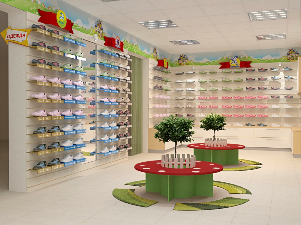
To successfully display a shoe range, the merchandiser needs to be aware of the latest fashion trends of the current season: what model, what color, heel, material is currently relevant. The merchandiser must have a good understanding of the needs and expectations of his customer. For example, when displaying shoes of an average price level, belonging to the “bridge” class collection, the most optimal is a three-level presentation of models. At the same time, on the top shelf shoe displays The most fashionable, expensive models with medium-high and high heels should be located. On these shelves we “focus” the attention of buyers who are aware of the latest fashion trends, know their worth and strive to attract the attention of others. The product that is in greatest demand and popularity is placed on the so-called “golden shelf” - this is the middle shelf. As a rule, consumers in this category also follow fashion trends and choose comfortable models with medium heels. Low-heeled and flat shoes are usually displayed on the shelves of the bottom row. It is designed for customers who value comfort, mobility, and versatility.
When presenting goods and visually forming shelves, it is worth remembering one of the laws of merchandising about the optimal length of eye contact. According to this law, the facing of small goods occupying less than 40 cm on the shelf is ineffective. It follows from this that it is better to combine shoe models of the average price level into 2-4 models, however, on one shelf the number of such blocks should not exceed 5-9 units, since according to research results, the human eye in one row of similar type of goods can catch only from 2 to 9 objects. In this case, the step of the groups can be from 0.20 to 0.40 m. When combining shoes into blocks, you must pay attention that the models must be similar in some respects: the same design, the same heel height, similar material texture, shoe color - and so on. To avoid the predominance of any color in the display of goods, the “parallel-perpendicular” method is often used, in which blocks of shoes are displayed parallel or perpendicular to the edge of the retail shelf in an alternating order. In this case, the arrangement of model blocks depends on the design features of the shoes (design, finishing, fittings).
20.03.2013 28662
It is unlikely that anyone will argue with the fact that sales depend on the competent display of goods in the hall. And if your sales don't seem to be high enough, maybe a little rearrangement will help. An expert and business coach in the field of visual merchandising, Nina Zaslavskaya talks about the basic principles of arranging shoes in the sales area, their advantages and disadvantages.
You should not neglect the principles of presentation of the assortment in a shoe store: by using them correctly, you can influence the buyer’s behavior and lead him in the right direction, or, conversely, distract attention and create conditions for a spontaneous purchase.
It’s worth saying right away that the principles described in this article apply only to stores with price positioning in the economic and middle segments. Luxury stores, as well as those who work according to the scheme “all stock is in the hall, the goods are taken out of the warehouse,” are guided by slightly different rules, worthy of a separate article.
There are at least four main ways to arrange shoes on the sales floor: by brand, by size, by collection and by category. All these principles have their own characteristics and disadvantages that should be taken into account in each specific case.
Arrangement by brands. Owners of multi-brand shoe stores often believe that “their brands are well known to everyone,” so they mistakenly believe that arranging shoes by brand will help the buyer navigate the product. In fact, the shoe brands that are really familiar to most Russian buyers can be counted on one hand, and they, as a rule, are sold only in brand stores. Most brands in the economic and middle segment are known only to professional shoemakers, and they are most likely sold in your store.
If you are not sure that your brands are on the top list of the most recognizable in Russia, do not take risks using brand placement. Otherwise, the store will not benefit in sales from using such a display: the buyer will simply ignore your concept, and his actions in searching for the product will be chaotic.
Use an arrangement by brand if your store’s assortment includes at least one brand with a high level of recognition, and you know for sure that it will attract a buyer. Highlight this brand into a separate brand corner, decorating it with branded POS materials. The equipment for such a corner may differ from the main equipment of the store, which will make it possible to mark the brand area against the general background, thus creating a kind of “shop-in-shop”.
Arrangement by size was common under socialism, and today can be used in economy format stores and discounters that sell remnants or incomplete size grids. For the seller, the principle of arranging by size is useful because it allows you to disguise the lack of sizes in individual models, and for the buyer it is convenient because it saves his time. The customer, upon entering the store, immediately approaches the equipment with his size, and does not need the help of a salesperson to find the size in stock. The disadvantage of this method is that if the buyer has a “floating size”, or the exact size of the model is not known, he will have to walk between two racks in search of the desired product. This can make the buyer feel irritated and feel like they have wasted their time.
The display by size signals to the buyer that the price of this product is low. Therefore, it is recommended to use it either during a sale or in a store that does not have image claims. In addition, the layout method by size is only suitable for large trading floors, since in fact it represents a slightly modified concept of “all stock in the hall.” When planning a store using this method, it is very important that the navigation with dimensions is clearly visible from the entrance. As for the division within dimensional zones, it is advisable to group shoes within them according to the “like with like” principle.
Arrangement by collections. From the buyer’s point of view, the concept of “collection” in the shoe industry is very arbitrary, because in the generally accepted understanding, a collection is a set of models that make up an ensemble, that is, they can be worn together. The concept of an ensemble does not apply to shoes, because a person cannot put one foot in a boot and the other in a high-heeled shoe. Therefore, in the shoe industry, a collection is understood as a set of articles (styles), united by one color scheme and the materials from which they are made.
Arrangement of collections in a shoe store is carried out using additional accessories: bags, scarves, belts, gloves and other goods. This display principle will be useful in a store in which sales of additional accessories make up a significant share, which is typical for outlets in the medium and medium-high segment. Buyers at this level of shoe stores are usually wealthy enough to purchase a pair of shoes and a bag with one check. In addition, the arrangement of collections in a shoe store directs the buyer towards a spontaneous choice, since it does not help him make a targeted purchase. This is why this method will not be effective in stores in the “mid-low” or “economy” segments, where people come to satisfy a specific need, and not “for a good mood.”
When arranging shoes among collections, you should take into account that accessories must completely match the color and style of the shoes next to which they are placed. Otherwise, it will no longer be a collection, and the meaning of such a grouping of goods will completely disappear. In addition, you should not overuse the number of bags, otherwise the shoes will simply get lost against the background of these larger accessories.
Arranging shoes by category- the best way to satisfy the specific desire of the client, because the product category is what the buyer came to the store for. For example, a buyer might be looking for “heels for prom,” “ballet flats to pair with jeans,” “magazine ankle boots,” “demi-season boots to replace old ones that get wet,” or “child’s shoes for school.” All these are specifically formulated desires of the buyer that the seller must satisfy. And arranging shoes by category is the best assistant in this matter.
To apply category display, you need to determine which product categories your assortment is divided into. In stores with a wide assortment, this division can be very detailed, for example, not just “shoes” are distinguished, but “stiletto heels”, “wedge shoes” and “low-heeled shoes”. In stores with a narrower assortment, it is enough to divide the goods into the categories “boots”, “shoes”, “sports shoes” and others.
Place products from more popular categories in the best places, and send models that have just been introduced into the assortment there. This will allow you to see how customers react to the new product. In the layout of products by category, the use of cross-merchandising methods is also encouraged, that is, the addition of shoes on the shelves with bags and accessories.
It is unlikely that anyone will argue with the fact that sales depend on the competent display of goods in the hall. And if your sales don't seem to be high enough, maybe a little rearrangement will help. Expert and...
It is necessary to present the product to the buyer not chaotically, but in accordance with a carefully developed diagram - planogram. On it, each product from the displayed assortment is depicted in detail, indicating the exact location of placement. The planogram is intended for rational management of the retail space in which products are sold. The scheme will help increase the impact of the item being sold on the visitor, sales volumes, and create a closer relationship between the product and the buyer. Advertising and PR Manager at Agro-Invest LLC Oleg Vlasov spoke about the principles and rules of leaving a planogram.
A planogram is a diagram of the display of goods on shelves and displays of retail outlets, which is compiled based on an analysis of the requirements of the product supplier, the capabilities of the retailer and customer behavior. It is performed manually or using computer programs in the form of images, drawings, photographs. The goal is to manage the perception and behavior of potential buyers. This is one of the effective tools for managing sales on the sales floor.
Using a planogram, you can increase turnover in your store and make money by selling profitable locations to suppliers. Sometimes an agreement is concluded between the supplier and the retail outlet, fixing the place of the product on the shelf.
A planogram helps:
The number of potential buyers and their distribution over the retail space determines the coefficient of importance of retail locations. Products that are in high demand occupy the most prominent positions. Product display should demonstrate products, facilitate their search and selection, and create consumer preferences. Rational placement of sold items stimulates the flow of buyers.
Read also:
When developing a planogram, the following principles are adhered to:
The planogram is developed according to the following rules:
Merchandisers or sellers are responsible for the correctness of the display. Department heads and managers regularly check the compliance of product placement on the sales floor with the planogram. If you do not comply with the supplier’s requirements or violate the display scheme, the supplier has the right to refuse to pay the bonus and further supply of products to this store.
They lay out goods vertically, horizontally, and also combine the arrangement. With vertical display, homogeneous products are laid out vertically on shelves. Example: one vertical strip is represented by yoghurts, the other by cottage cheese, then sour cream, fermented baked milk. The buyer has better guidance when choosing an item. Also, the products are placed horizontally along the entire length of the equipment. Example:
Other units or price tags should not obscure the information on the packaging. The main products are placed within sight of the entrance.
Shelf space can be divided into:
In the first case, you can do whatever you want, however you want, depending on your goals. If we consider the shelf space of the network, then a problem arises in the form of occupancy of this space by competitors, as well as the network itself, which ultimately makes the decision about where to put your product. Therefore, in this case, it is necessary to approach the decision of the location of the product in more detail.
To determine the most optimal location for your product, it is necessary that you have an understanding of the existing planogram, what it looks like without your product. To do this, it is enough to request it from a representative of the retail chain (which is sometimes impossible) or simply take a photo of your product category in the nearest supermarket. Transfer this photo to your computer and open it in any simple graphics editor (for example, Power Point). Next, take a photo of your product and transfer it to the planogram. Try to place your product in different places, guided by visual perception (for example: there should not be a similar or merging product nearby, unless of course you specifically pursue this goal), pay attention to your main competitors, do not place the product on the edge of the shelf.
Video on how to create a planogram:
Different companies may have different schemes, but they all share a common design principle:
In some cases, the supplier provides its own planogram. If the assortment expands, consumer demand changes, and adjustments are made to the planogram.
There are many programs for creating product layout diagrams:
 Example of a planogram compiled in Excel
 All these programs will help you create effective layouts, optimize layout and space, and reduce the number of errors during layout. They will create a directory of retail equipment, calculate shelf turnover, and provide a visual layout of positions.
Let's look at how to create a planogram for a grocery store.
The share of the most profitable products is increasing. More space is allocated for them. If cutlets take up a square meter of space and brought in twice as much profit this month as pancakes, which take up the same amount of space, then the area where the pancakes are placed is reduced in favor of the cutlets. The space for cutlets is increased to 1.5 square meters. Increasing the area may contribute to increased sales of cutlets.
Using the same principle, diagrams are drawn up for products of other categories.
Let's take the example of beer and branded refrigerators. The planogram is quite simple and includes 3 main zones:

Bakery products are grouped by type, variety: separately black, white, bread without yeast, with additives, whole grain, sandwich rolls, unsweetened, sweet pastries, desserts, pastries, cakes. Non-perishable products are placed separately.
Confectionery products are laid out by type and grade on internal counters. Sweets are poured into drawers and cabinets near the walls. Enough space is allocated in the refrigerator for cakes and cream pies.
Products from the lowest and highest shelves sell poorly. A shelf at eye level is the best option. Closer to the buyer is a product that is nearing its expiration date.
Furniture is placed so that visitors can examine the furniture and individual products. Large stores decorate the interiors of apartments with a display of furniture sets. To attract attention and create coziness, kitchen furniture is decorated using a variety of decorative elements: glasses, plates and other items.
Cheap and expensive products are separated. The cheap ones are located closer to the entrance. At the entrance, the price is especially clearly visible; furniture can be purchased faster. The brightest goods are placed in plain sight.
Furniture for living rooms, bedrooms, and office is divided. You can move products around the hall once every two weeks. Furniture that sells poorly is placed in prominent places. If the buyer comes again, he may notice something he didn’t notice before.
Products are divided into large-sized, medium-sized, and small-piece products. Interconnected groups are located nearby (nails, screws close to tools, extension cords).
Dry mixtures are laid out on racks in vertical blocks. The heaviest packages are placed on the lower shelves. Fastening elements are grouped by type (screws, dowels), purpose (for windows), and size. Information materials are also useful in the trading floors.
Equipment and tools are laid out from the waist up. Piece goods are located in the checkout area on racks. Stands are intended for wallpaper. The buyer is given the opportunity to independently unroll the roll and inspect it. The diagram shows the color scheme of the wallpaper, its type, and material.

The warehouse area should be visually divided into zones. Racks, sections, shelves are equipped with signs. Using a detailed diagram, the employee will find the product by name and address. Products are placed according to the principle “closer to demand - closer to delivery.”
The diagram identifies zones for long-term storage and short-term storage. Products that are in low demand are placed in long-term storage areas.
The strategy for rationally placing goods must be thought out to the smallest detail. The purpose of the planogram: to increase trade turnover, increase product sales, improve the flow of potential buyers, increase competitiveness for goods of the same category from other manufacturers. Thanks to a carefully developed planogram, sales volume will increase, and the time spent searching for the required product will be reduced.
I suggest sharing the planograms you created in the comments.
Interior design today plays the same role as a beautiful display case and attractive packaging of a product: the more customers like it, the more often they visit it, and the more purchases they make.
Those who are involved in sales know that there is a lot of competition between shoe stores. Simply presenting a fashionable and high-quality product is no longer enough: in order to stand out among a million others, it is important to create a special atmosphere - to properly design a shoe store.
Before choosing a specific style, it is important to consider that the appearance of a shoe store depends on many factors, including the type of product, prices, and gender of the buyer. A method that works great in a classic shoe boutique can lead to failure in a youth or sports store, and vice versa. But there are general principles that help to increase sales and make the space of a shoe store memorable, and they are related to psychology:
A positive attitude and a good first impression are ensured by the entrance area (2 -7 m immediately after entering the room). The location of the entrance and retail equipment should not interfere with the natural entrance of customers. The entrance area must correspond to the size of the retail space. A person who enters a store for the first time should see the best and most seasonally appropriate types of shoes.
A real “gold mine” that can increase the sales of any shoe store if you approach it wisely. Racks and shelving in the checkout area can motivate shoppers to make impulse purchases. This can be achieved through various related products, promotional items or attractive products for children. 
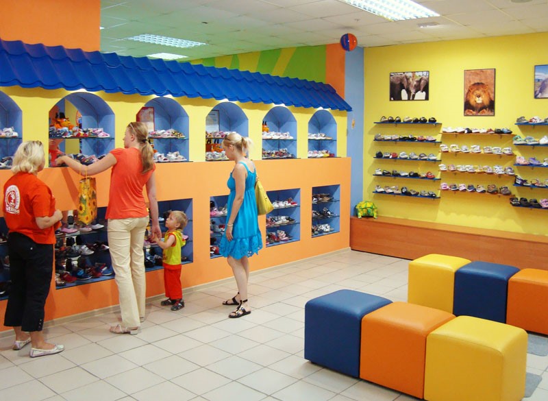
The design of a shoe store for children should be pleasant, but not stressful or distracting from trying on, so it is better to avoid acidic shades. Take calm tones as a basis and dilute them with bright furniture, inserts or accessories.
Your little clients will not always come with cleanly washed hands, so the interior decoration should be practical. For example, you can use plastic panels that are easy to clean.
A good move would be to install a TV that shows cartoons. Children will be happy to spend more time with you while parents calmly select shoes.
Use colors to zone the room. Shoes for boys can be located in the blue zone, for girls - in the pink zone.
To prevent the store from seeming boring, use bright price tags, stickers, toys, posters with cartoon characters.

What attracts women can scare men away - when designing, take into account the gender of the buyers.
Shoppers find the most attractive stores where the interior is designed like a showroom for a designer studio of exclusive shoes. Women, as a rule, are attracted to shiny details in calm lighting, beautiful play of several colors. In the interior for selling women's shoes, you can and even need to use catchy finishes, fancy ornaments and patterns. Customers, having not yet looked closely at the product, but having seen fashionable elements in the interior, will want to stay here.
In the men's room, all goods should be available so that any pair can be picked up without problems, since men will not make their way through the clutter of pairs to the one they like, as women do. Do not use pretentious colors: the color palette should be calm, restrained, and elegant. The “selling” items in a men’s store are most often the natural colors of leather and wood.
When working on the design, do not forget that the interior of the shoe store needs to be designed so that it is not only memorable, but also comfortable. Everything in the room should tell the buyer that he is always welcome here, that this is a place where the main value is the client’s comfort. This comfort means the following points:
The presentation provides information to a wide range of people with various...

Employee certification is primarily intended to identify potential...

Tutorial. Taganrog: TRTU Publishing House, 1999 Chapter 11. Statistical...